Warm Earthy Palettes: The Case for Going All In With Color


Every advice column tells you the same thing: use earth tones as accents. Throw pillows. A jute rug. Maybe one terracotta vase on a shelf. Ground yourself without committing.
It's not wrong advice. But it's timid. And the rooms that actually look intentional — the ones you screenshot and send to friends — are almost never the rooms where someone dipped a cautious toe into ochre.
The rooms that work are the ones where somebody decided to go all the way.
What Everyone Gets Wrong About Earth Tones
The default move with earthy colors is to treat them as relief valves — punctuation in an otherwise neutral room. Terracotta pillow against a greige wall. A rust-toned candle on a white shelf. These are fine. They're also forgettable.
The mistake isn't the color choice. It's the dose. When an earthy tone appears in tiny amounts alongside an aggressively neutral backdrop, it reads as an afterthought. The room doesn't commit, so the eye doesn't either.
What actually works — and what designers have been doing quietly for decades before it became an Instagram trend — is the inverse. You take the warm, grounded shade and you let it lead. Not as an accent. As the atmosphere.
Sherwin-Williams' color marketing manager, Emily Kantz, put it plainly when speaking to Martha Stewart: browns have been gaining momentum specifically because of their association with stability and comfort. Not because someone put a brown vase on a white shelf. Because spaces lived in brown tones register differently — they feel held, which is exactly what people are looking for.
That psychological shift doesn't happen at 20% of a room. It happens when the color has room to breathe.
What Is Color Drenching, Really?
Color drenching is the practice of painting a room in a single hue — walls, ceiling, trim, and often the door — rather than stopping at the skirting boards. Instead of treating architectural edges as places to switch colors, the paint wraps every surface in one continuous tone. The effect is an immersive, cocoon-like room where the color becomes the mood rather than just the decoration. For earthy palettes specifically, it produces the grounded, enveloping quality that accent use rarely achieves.
This isn't a new idea. Edward Bulmer, a British natural paint specialist, points out that historically, timber-panelled rooms were painted this way specifically because cutting in at every edge of the panelling was impractical. It's experiencing a revival not because it's fashionable but because people have figured out it actually works. When the ceiling and trim no longer break up the room in contrasting white, walls read taller, spaces feel more intentional, and the color pays off.
The Earthy Palette Breakdown — Which Tone Does What
Not all earthy shades behave the same way when they take over a room. Worth knowing before you commit to a 5-liter pot.
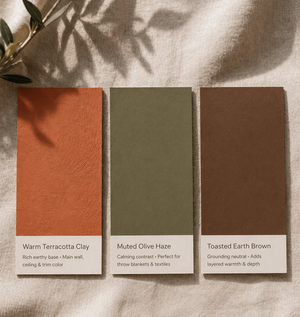
Terracotta and clay reds are the highest-stakes choice and the most rewarding when they land. Sherwin-Williams' Cavern Clay (SW 7701) has a Light Reflectance Value of 20 — it absorbs light aggressively, which is exactly why it creates that golden-hour feeling in the evening. The trade-off: north-facing rooms with little natural light can read muddy rather than warm. In rooms with afternoon sun? It's extraordinary. Benjamin Moore's Baked Terra Cotta sits in similar territory — rich red-brown undertones, grounding without going dark enough to close a room in.
Olive greens are the more versatile entry point. Benjamin Moore's Tate Olive (LRV 21.6) has subtle yellow undertones that keep it from reading cold even in low light — and because green sits at the intersection of warm and cool, it pairs with nearly everything else in an earthy palette without competition. Sherwin-Williams' Olive Grove pushes warmer, with stronger brown notes, which makes it feel more overtly rustic. If you're going fully drenched in olive, Dark Olive from Benjamin Moore (LRV 13.52) is the more committed choice — darker, more dramatic, particularly good in rooms that lean toward evening use.
Warm browns — not the dated 2000s chocolate, but the nuanced plaster-y taupes and aged earth shades — behave most like an evolved neutral. They photograph quietly but read as warm in person. Designer Doniphan Moore (no relation to the paint brand) describes it well: in certain parts of the day, a custom warm brown wall can feel almost golden, and in the evening with artificial light, it shifts toward gray-green. Plaster finishes amplify this color-shift quality in a way standard paint doesn't.
Room by Room: Where Each Earthy Shade Hits Hardest
The conventional wisdom says keep bold choices confined to bedrooms — safer if it doesn't work, easier to fix. Honestly, that's too cautious.
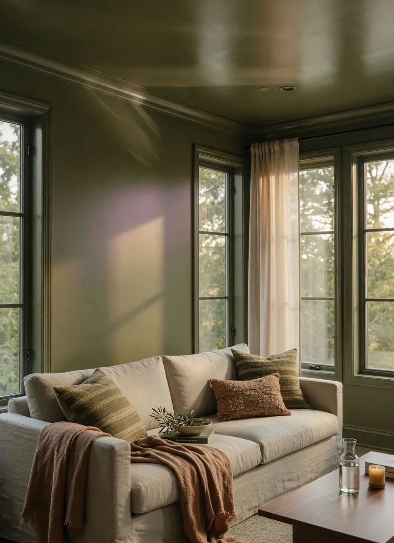
Living rooms are where olive green color drenching earns its keep. Designer Maggie Griffin chose Benjamin Moore's Dark Olive in a satin finish for an entire living room — and noted specifically that the satin sheen "highlights pretty shadows throughout the day, unlike flatter paints." It's a useful trick: the finish becomes part of the light strategy, not just a durability decision. Muted greens in this space tend to translate well across different orientations — warm enough in lower light, muted enough that south-facing rooms don't get overwhelmed.
Bedrooms are the classic case for full terracotta or warm clay drenching. The cocooning effect works hardest in rooms that exist primarily for rest — the color envelops rather than energizes, and because you're not staring at it while trying to work, the richness is a feature. Farrow & Ball's Porphyry Pink (from their historical earthy red collection) is particularly effective here — sitting between terracotta and deep blush, it shifts from rosy in morning light to deeply warm by lamplight.
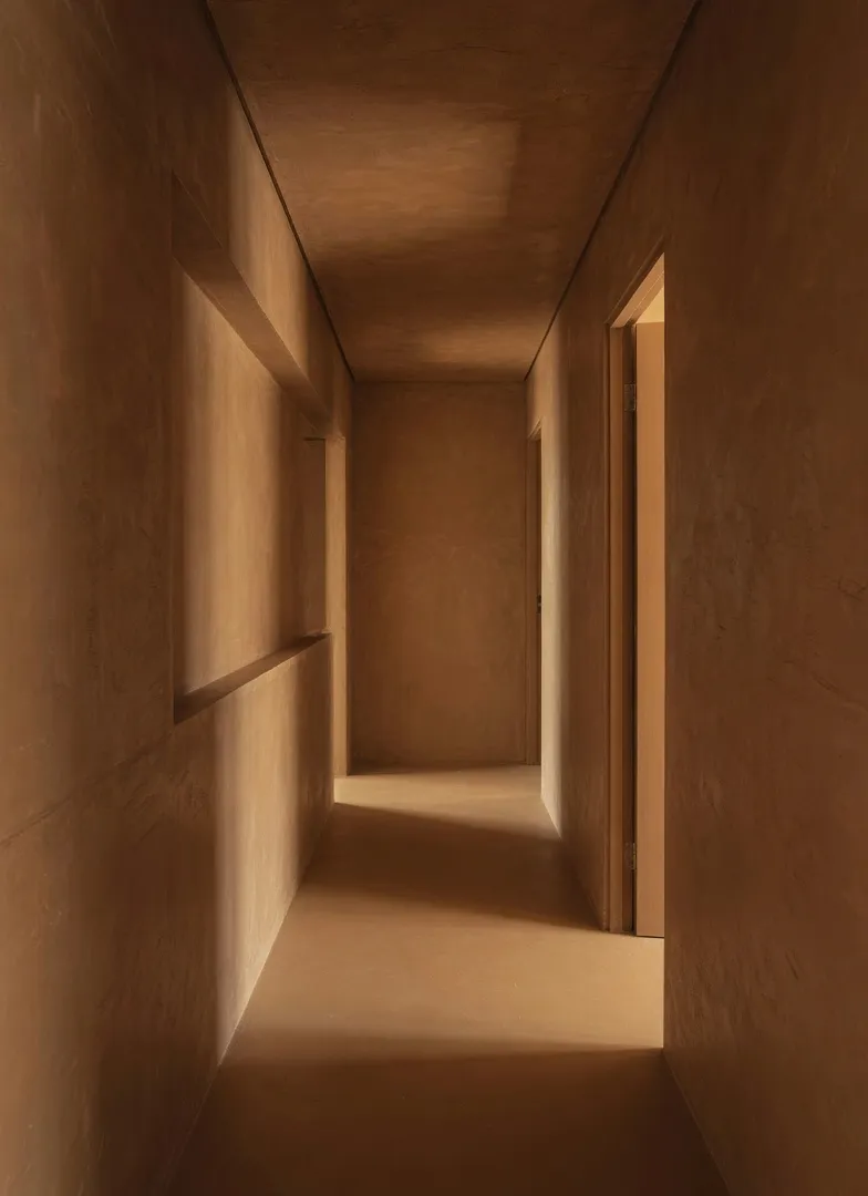
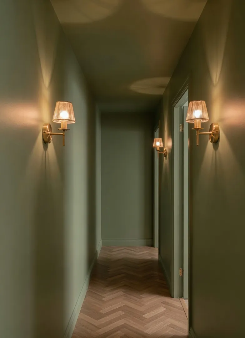
Hallways and connecting passages might be the sleeper pick for color drenching. They're typically narrow, often dark, and standard white makes them feel like an afterthought. One continuous earthy tone through a hallway — warm brown or a deep ochre — does something architecturally flattering: it makes the transition between rooms feel deliberate. Edward Bulmer's team specifically calls these "connecting spaces" out as among the best candidates for drenching, because the single color maintains simplicity while the color choice adds character.
Small rooms — powder rooms, home offices, reading nooks — benefit from the counterintuitive math of color drenching. Dark, saturated colors in small rooms don't shrink them further. They remove the visual tension of where one color ends and another begins, which paradoxically makes the space feel more complete.

Before and After: What the Shift Actually Looks Like
Reading about color commitment is one thing. Seeing what changes — specifically, concretely — is another. Here are three real-scenario transformations that show exactly what color drenching an earthy palette does to a room.
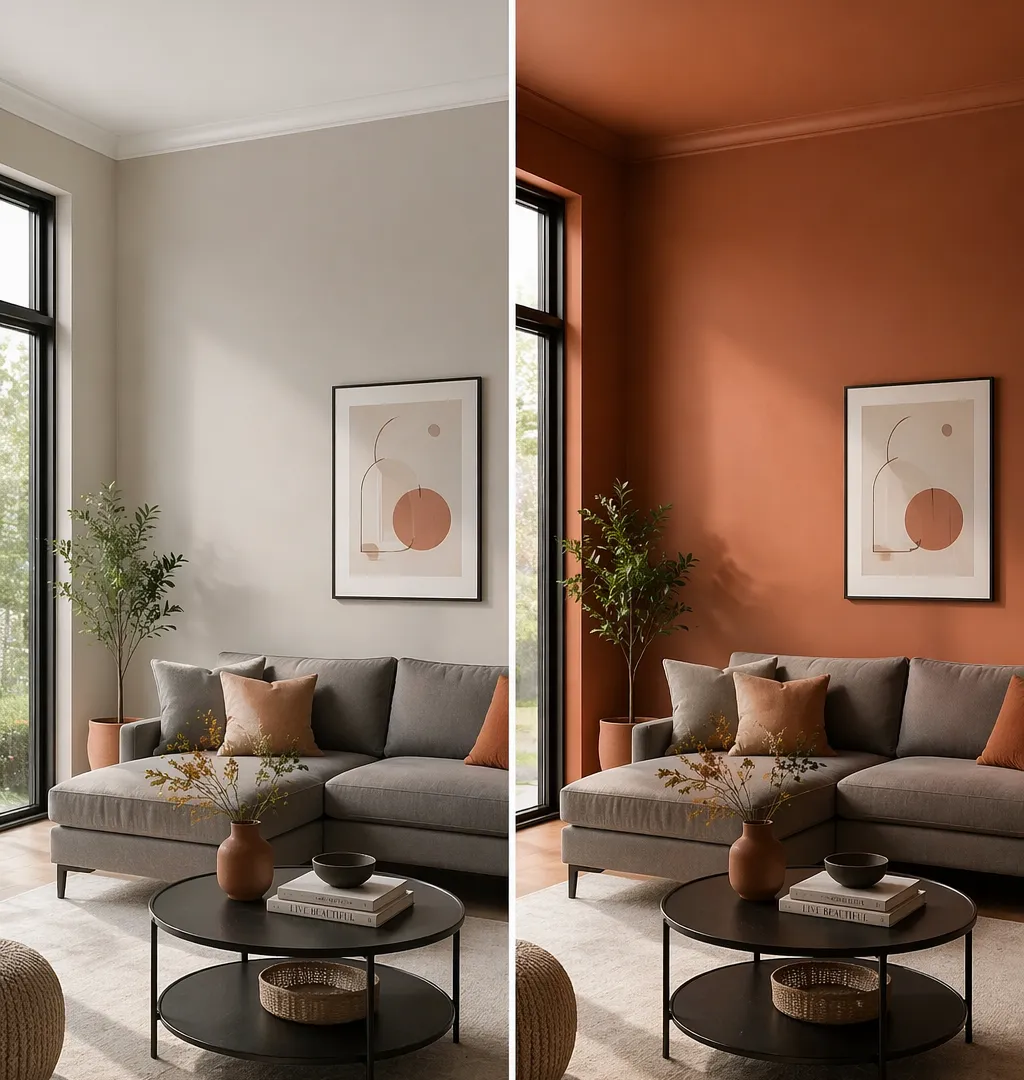
The Greige Living Room → Warm Clay Drench
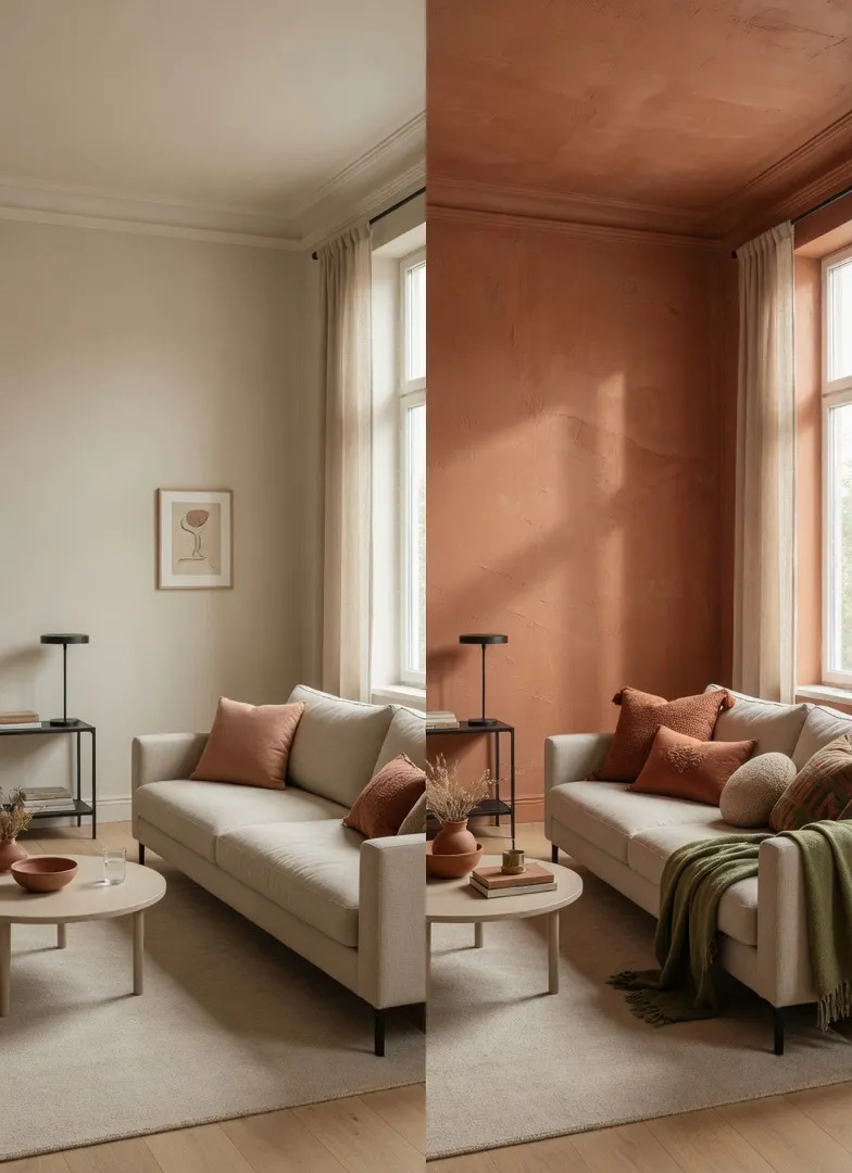
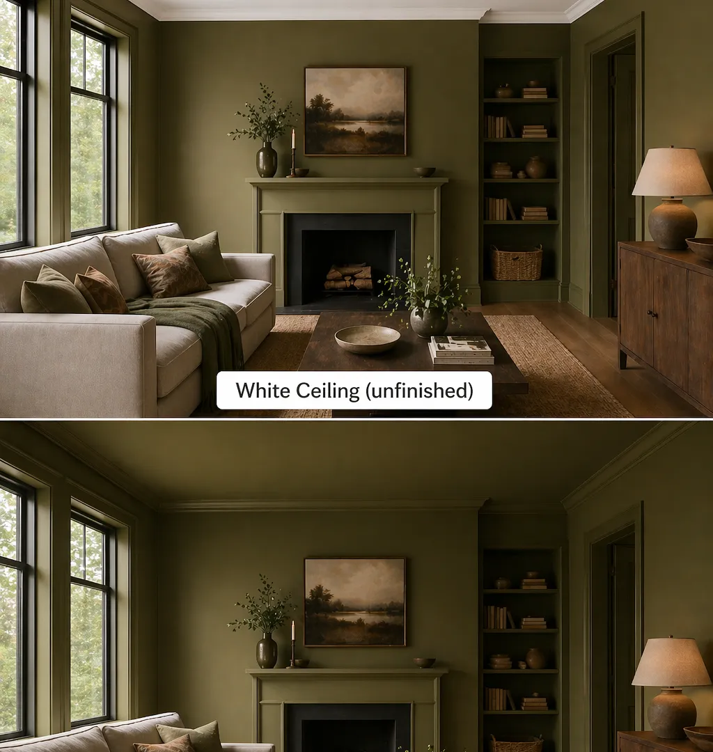
Before: A 14×18 ft living room in Sherwin-Williams Accessible Beige — the classic greige that reads "safe" in the paint store and "beige limbo" on the walls. White ceiling. White trim. A terracotta throw pillow on a gray linen sofa, doing its best. The room was clean. It had zero presence.
After: Walls, ceiling, and trim repainted in Sherwin-Williams Cavern Clay (SW 7701, LRV 20). Same gray sofa. Same furniture arrangement. Same rug. The pillow that once looked like a desperate attempt at personality now looks like it belongs. The room — in the same afternoon light — reads warm from every angle. The white ceiling had been pulling the eye up and making the room feel unresolved. The clay ceiling brought everything down into a deliberate, grounded envelope. Visitors stopped commenting on the color and started calling the room "cozy," which is the correct result.
The key change: Not the furniture. Not the accessories. Just the commitment. The terracotta was already in the room — it was just fighting for its place. Once it took over the surfaces, it stopped fighting and started working.
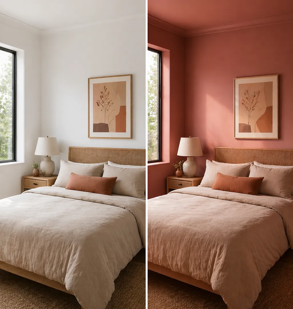
The White Bedroom That Felt Like a Hotel (Not a Good One)
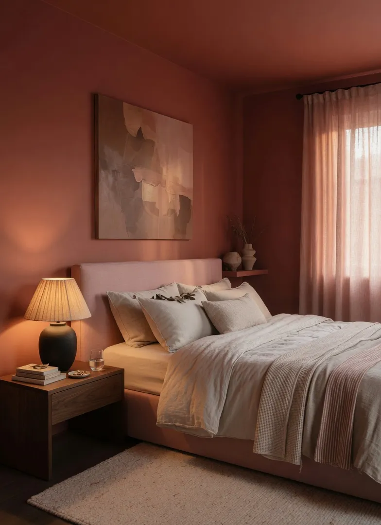
Before: A master bedroom with bright white walls, white ceiling, white trim. A queen bed with oatmeal linen. Wicker nightstands. Warm-toned art on the walls. Every earthy instinct was there in the decor — and every bit of it was being swallowed by the white box surrounding it.
After: Farrow & Ball's Porphyry Pink (one of their historic earthy reds, sitting between terracotta and deep blush) on all four walls, ceiling included. Trim painted to match. The oatmeal linen stopped disappearing and started reading as a deliberate neutral counterpoint. The wicker nightstands, which had looked almost invisible against white, developed texture that the paint amplified. The room went from "clean and empty" to "somewhere." In morning light, the walls are rosy and warm. By evening lamp, they deepen into something closer to burnt sienna.
What the homeowner said: "It feels like a completely different room and we didn't move a single piece of furniture." That's the most common reaction — and it's because color drenching changes the room's atmosphere, not its contents. The objects were always good. They just needed a context that let them land.
The Dark Hallway That Became an Asset
Before: A 4-foot-wide hallway, north-facing, connecting front door to living area. Painted in a warm white that photographed yellow and felt dingy in person. Every designer advice column said: "keep narrow spaces light." So: light. And therefore: problem.
After: Benjamin Moore's Tate Olive on all surfaces — walls, ceiling, the narrow trim between door frames. LRV 21.6, which is darker than the white it replaced, on paper a reckless move in an already dark corridor.
The logic: the white wasn't making it brighter. It was just making the dimness more visible by contrast. The olive removed that contrast entirely. Walking through the hallway now, the color wraps rather than exposes. Two warm-toned brass sconces mounted at mid-height and bulbs at 2700K keep the space from reading dark even at night. The hallway went from "that problem corridor" to the first thing people comment on when they visit.
The lesson here: "Keep dark rooms light" is a rule worth questioning. Sometimes the better move is to stop fighting the darkness and let the color make it deliberate.
The Paint Finish Question Nobody Asks (But Should)
Most of the internet's color drenching advice stops at "pick the color." The finish question is where the real nuance lives, and getting it wrong is how drenched rooms become depressing.
Matte and flat finishes are the standard recommendation for earthy color drenching — and for good reason. They absorb light rather than bouncing it, which deepens the color and gives it that saturated, plaster-like quality. Russet terracottas and olive greens read most like their true selves in a matte finish. The problem: they're harder to clean, which matters in hallways and anywhere hands touch walls.
The workaround that actually holds up: use eggshell on the walls for workability, and go matte on the ceiling. The ceiling is where matte finish pays off the most (no fingerprints, no cleaning needed), and keeping the wall in eggshell means you keep some of the light-shifting quality while gaining durability.
Satin is worth considering for woodwork and trim in a drenched room — same color, different sheen. It creates distinction without introducing a contrasting tone. Maggie Griffin's Dark Olive approach (satin throughout) is the alternative school of thought: the slightly higher sheen on trim reads as a natural architectural break, and the "shadow highlighting" effect in satin gives the room more life across different times of day.
Gloss on trim in a drenched room is generally a mistake unless the room has very specific proportions. It bounces light in a way that pulls the eye to the woodwork specifically, which breaks the immersive effect.
When the All-In Approach Actually Fails
Worth being honest about this, because it does fail — and usually for predictable reasons.
North-facing rooms with no direct light are genuinely challenging for terracotta drenching. An LRV under 20 in a dark room means colors can absorb so much light the room loses its warmth entirely and reads cold-brown. If you're committed to the color, the fix isn't switching to a lighter shade — it's adding more light sources, specifically warm-toned bulbs in the 2700K range. At that temperature, the room's artificial light supports the warm palette rather than fighting it.
Mixing earthy tones carelessly produces muddy results. A rust-red terracotta drench on the walls paired with an olive sofa and a warm brown rug sounds logical — all earthy — but the undertones can clash in ways that neutralize each other. The cleaner move is to drench in one dominant earthy shade and let texture do the layering work: nubby boucle, smooth linen, matte plaster, brushed brass. When multiple earthy colors compete, they cancel. When one leads and texture varies, the room has depth.
Ceiling exclusion undermines the technique. Some people drench the walls but leave the ceiling white. Architecturally, that means you've painted a box with a lid, and the white ceiling draws the eye upward in a way that works against the grounded feeling earth tones are supposed to deliver. The ceiling is the part that most people find intimidating to paint, and it's also the part that makes the biggest difference.
Starting Small Without Chickening Out
The powder room is the right laboratory. It's contained, low-stakes, typically used briefly, and — because of its small scale — a drenched earthy shade will be fully visible within half a day's painting.
Pick one of the terracotta options with an LRV between 18 and 28. Go with Savannah Clay from Benjamin Moore if you want something with rich red-brown depth, or Copper Wire from Sherwin-Williams if you want something slightly more versatile and amber-toned. Paint the walls. Then paint the ceiling the same color. Then the trim. Step back.
If you finish and want more, you've found your shade and your commitment level. If you finish and feel the room is a mistake, you've learned something useful in 40 square feet rather than in your living room.
What you'll almost certainly find: the room feels smaller than you expected before you painted the ceiling, and exactly the right size after. That's the technique working.
From there, the living room is the next move. Take the palette you've tested and scale it up — not by repeating the same shade necessarily, but by applying the same logic. Commit to the color. Don't make it fight for its place in the room. Bring in natural textures — linen, rattan, raw wood, brushed metal — and let them provide the variation that color no longer needs to.
Warm earthy palettes have been building momentum for the right reasons. Not because of trends specifically, but because they're solving a problem: after years of neutral rooms that felt sterile and interchangeable, people want to walk into a space and know exactly where they are. An enveloping terracotta room has that quality. A room with one terracotta throw pillow does not.
About the Author: Elena Vance
Interior design enthusiast and DIY expert. Elena Vance has spent over a decade curating spaces that blend modern aesthetics with everyday functionality. Passionate about helping you create a home that tells your unique story.


