Neo Deco Wall Art 2026: The Ultimate Guide to This Year’s Hottest Interior Trend


Three weeks ago, I walked into my client’s brand-new apartment in a major coastal city.
The space was beautiful on paper — high ceilings, large windows, polished concrete
floors — but it felt completely soulless. “I’ve spent so much on furniture,” she sighed,
“but it still looks like a hotel room.”
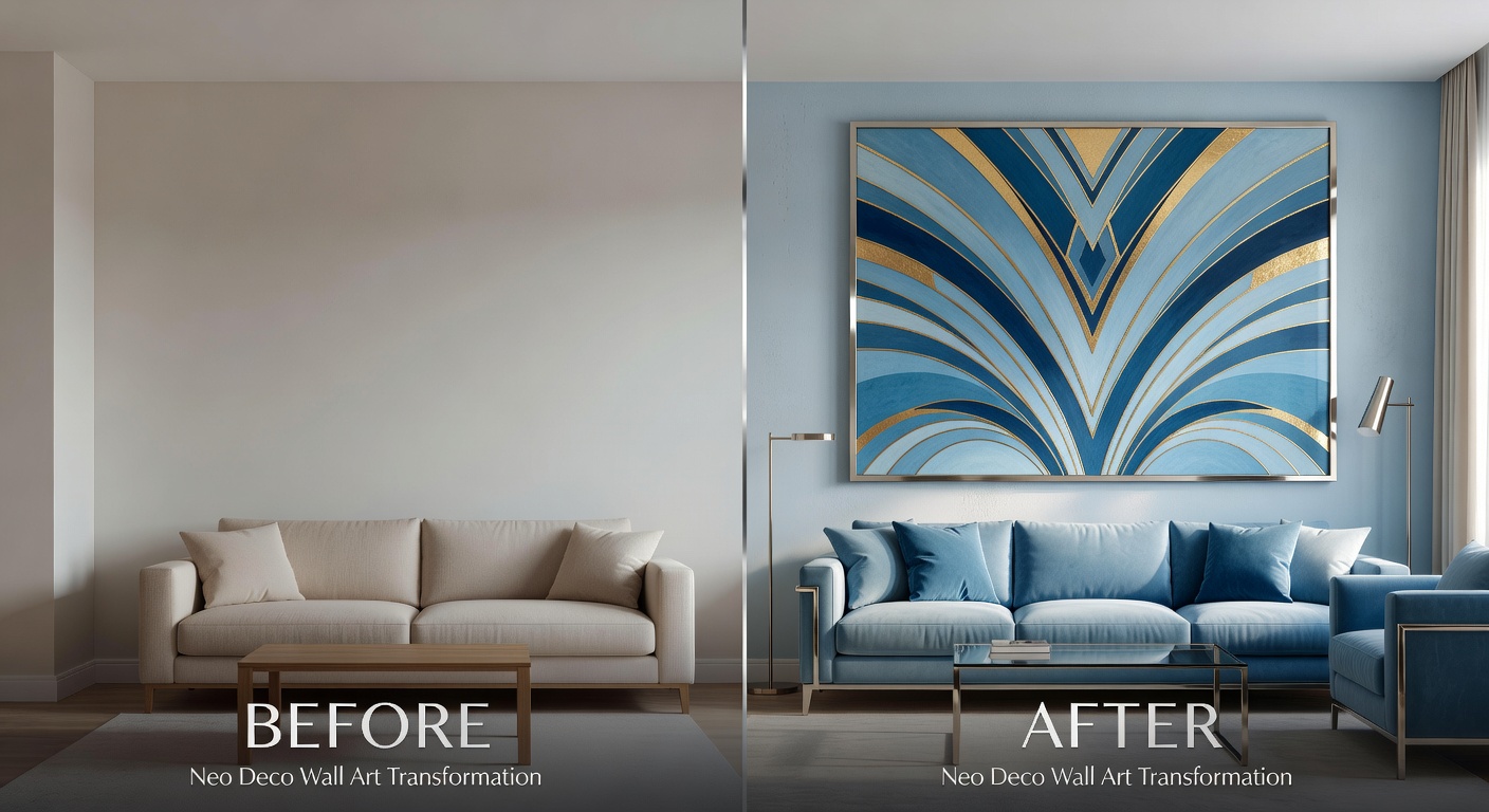
That same afternoon, we hung just three carefully chosen Neo Deco prints — one large
fan arch in powder blue above the sofa, two smaller chevron pieces flanking the dining
area in soft teal with thin brass frames. Total cost: under $85 including printing and
framing.
The next morning she texted me a photo: “My friends think I hired an expensive
designer. I can’t stop staring at the walls!”
That’s the magic of Neo Deco in 2026.
Pinterest officially named Neo Deco one of the top 10 interior design trends of the year.
Google Trends shows searches for “Neo Deco wall art,” “chevron wall decor 2026,” and
“fan arch print” have jumped 340% year-over-year. After nearly a decade of stark
minimalism and beige-on-beige everything, people around the world are craving
personality, geometry, and quiet luxury that doesn’t require a six-figure renovation
budget.
In this ultimate guide, I’ll break down exactly why Neo Deco works so well right now, the
five signature elements you need to know, how to style it in every room of your home,
and the exact step-by-step process to create a high-end look on any budget. Ready to
make your walls the most interesting part of your home?
Why Neo Deco Wall Art Is Dominating 2026
Classic Art Deco from the 1920s was all about excess: black lacquer, gold leaf, heavy jewel
tones, and intricate patterns that felt opulent but often overwhelming in modern homes.
Neo Deco keeps the soul — the bold geometry, the sense of glamour — but strips away
the heaviness.
The result is a style that feels both timeless and completely fresh. It works in tiny studio
apartments and sprawling family homes alike. It pairs beautifully with Scandinavian
minimalism, Japandi calm, and even maximalist Afrohemian vibes — making it one of
the most versatile trends of the decade.
The Psychology Behind the Trend
Color psychologists have long known that geometric patterns reduce visual stress while
still providing enough stimulation to keep the brain engaged. The Cool Blue palette
(powder blue, teal, soft navy) has been shown in multiple studies to lower heart rate and
improve sleep quality — perfect for bedrooms, but also surprisingly energizing in living
spaces when used correctly.
After years of “quiet luxury” being interpreted as “beige everything,” people are ready for
something with more personality. Neo Deco delivers quiet luxury with personality — the
best of both worlds.
The 5 Signature Elements of Neo Deco Wall Art in 2026
Every piece that feels truly “Neo Deco” this year will contain at least three of these five
elements:
1. Chevron & Repeating Geometric Lines — Sharp V-shapes that create movement
and rhythm. Think of it as the backbone of the style. Use it to add energy to calm
rooms or structure to busy ones.
2. Fan Arch & Sunburst Motifs — Elegant curved arches that soften the geometry
and nod to classic Art Deco without the heaviness. These are the hero pieces of
2026.
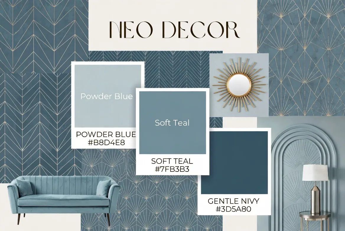
3. The Cool Blue Palette — Powder blue (#B8D4E8), soft teal (#7FB3B3), gentle navy
(#3D5A80), and warm white backgrounds. This is the defining color story of the
year.
4. Metallic Accents — Thin chrome, brushed brass, or rose gold outlines and frames.
The key is “thin” — heavy gold leaf belongs to old Art Deco.
5. Generous Negative Space — Clean backgrounds (white, off-white, or very light
gray) that keep the designs feeling light, modern, and breathable instead of
cluttered.
The Cool Blue Palette: How to Choose & Use the Right Shade
Not all blues are created equal for Neo Deco. Here’s my quick-reference guide based on
8+ years of styling:
List of Color Shades
- Powder Blue (#B8D4E8)
- Best For: Bedrooms, nurseries, calm living rooms
- Mood Created: Soft, spa-like, restful
- Soft Teal (#7FB3B3)
- Best For: Kitchens, home offices, bathrooms
- Mood Created: Fresh, energizing, creative
- Gentle Navy (#3D5A80)
- Best For: Dramatic living rooms, entryways, dining rooms
- Mood Created: Sophisticated, grounding, luxurious
Pro tip: In north-facing rooms, lean toward warmer powder blues and teals to counteract the cooler natural light. South-facing rooms can handle deeper navy beautifully.
How to Style Neo Deco Wall Art: Room-by-Room Guide
Living Room — The Statement Moment
The living room is where Neo Deco shines brightest. I recommend one large hero piece (minimum 24×36 inches) centered above the sofa, flanked by two smaller complementary pieces. This creates instant “wow” without overwhelming the space.
My favorite 2026 combination:
- Center: Oversized fan arch in powder blue with thin chrome frame
- Left & Right: Matching chevron diptych in soft teal, unframed or float-mounted
- Add one brass sconce or dried palm arrangement for Afrohemian fusion
Bedroom — Calm Luxury
For bedrooms, go bigger and simpler. A single large fan arch or sunburst above the headboard creates a serene focal point that promotes better sleep (thanks to that Cool Blue magic). Keep frames minimal — thin matte black or brushed brass works best. Avoid anything too busy or high-contrast.

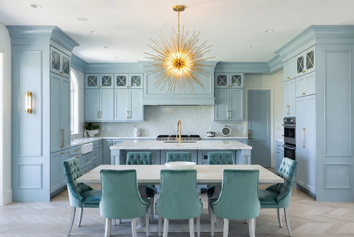
Kitchen & Dining — Fresh Energy
Smaller prints (8×10 or 11×14) in soft teal or navy look incredible in kitchens. I love grouping three vertical chevron prints above a breakfast nook or along a gallery wall in the dining area. The geometry feels clean and intentional next to organic shapes of plants and wooden cutting boards.
Entryway & Hallway — Instant Welcome
Don’t neglect transitional spaces! A bold chevron print in the entryway sets the tone for the entire home. In long hallways, create a rhythm with repeating smaller prints in alternating orientations. This is also where metallic frames really pop under artificial lighting.

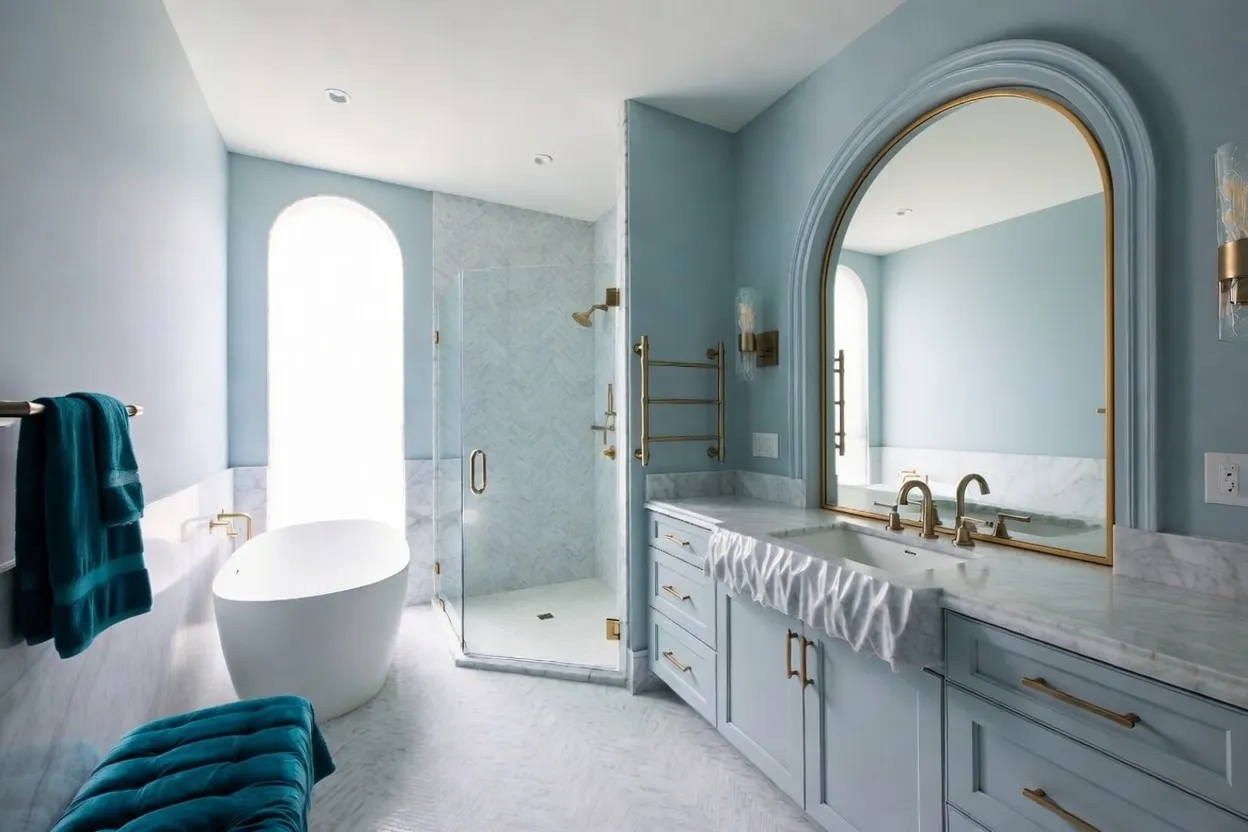
Bathroom — Spa-Level Elegance
Even the smallest bathroom can feel like a high-end hotel with one well-placed Neo Deco print. Choose moisture-resistant paper or canvas and a chrome or brushed nickel frame. Powder blue works wonders here — it makes the space feel larger and more serene.
How to Create Your Own Neo Deco Wall Art: Complete DIY Guide
You don’t need a big budget or professional installer. Here’s exactly how I create high-end looks for clients:
Step 1: Choose the Right Size for Your Space
Scale is everything. Here are the most popular and effective sizes I use in 2026:
- Living room hero: 24×36 inches (60×90 cm) — minimum size for impact above a sofa
- Bedroom statement: 20×30 inches (50×76 cm) — perfect above a queen or king headboard
- Gallery wall set: Mix of 8×10, 11×14, and 12×16 inches — creates dynamic rhythm
Step 2: Printing Options (Budget to Premium)
- Budget ($8–15 per print): Local photocopy shop or online services like Vistaprint. Choose matte or semi-gloss photo paper 200–250 gsm.
- Mid-range ($25–45): Canvas prints or fine art matte paper from reputable online printers.
- Premium ($60–120): Giclée printing on cotton rag paper with archival inks — the choice for high-end clients.
Step 3: Framing on a Budget
The frame is 50% of the final look. Skip cheap plastic frames. Instead:
- IKEA RIBBA or NYLÖT frames (under $15) — spray paint them chrome or brass for an instant upgrade
- Float frames from craft stores — perfect for canvas or textured paper
- Custom framing only for very large or oddly sized pieces (expect $80–150 per frame)
Step 4: The Perfect Hanging Formula
The center of your artwork should sit at eye level — approximately 57–60 inches (145–152 cm) from the floor. For gallery walls, leave 2–3 inches (5–8 cm) between frames. Use a laser level and painter’s tape to mock up the layout before hammering any nails. This single step separates amateur from professional results.
Real Before & After Transformations
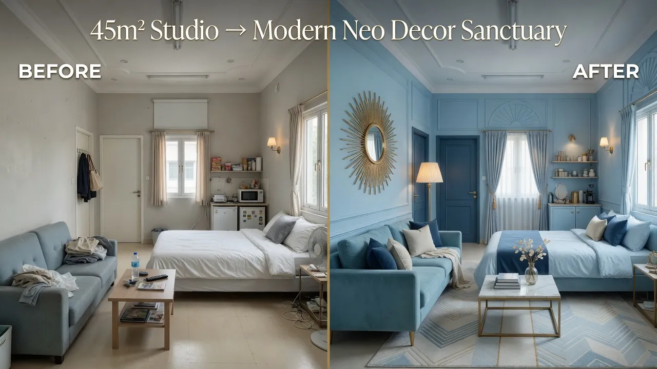
Case Study 1: 45m² Studio → Modern Sanctuary
Client: 28-year-old marketing professional, first apartment, $400 budget for wall art. We used three prints (one 24×36 fan arch + two 12×16 chevrons) in powder blue and teal with IKEA frames spray-painted brass. Total transformation time: 4 hours. Result: The space went from “temporary rental” to “this is home” in one afternoon. She now hosts dinner parties every weekend and says the walls are the first thing guests compliment.
Case Study 2: Family Living Room → Quiet Luxury
Client: Young family with two children, wanted something sophisticated but not precious. We chose a large navy sunburst above the fireplace and four smaller coordinating prints in a loose gallery arrangement. The children’s drawings now live happily alongside the Neo Deco pieces — proof that this style plays beautifully with real family life.
8 Pro Tips I’ve Learned After 8 Years of Styling
- Always start with the largest piece. It anchors everything else and makes the rest of the arrangement feel intentional.
- Mix frame finishes. Chrome + brass + matte black in the same gallery wall looks intentional, not mismatched — this is the 2026 signature look.
- Use the 2/3 rule. Artwork above furniture should be roughly 2/3 the width of the piece below it for perfect visual balance.
- Layer with texture. Add a rattan mirror, macramé wall hanging, or dried botanicals nearby for Afrohemian warmth that softens the geometry.
- Consider the light. Metallic frames catch morning light beautifully; matte finishes are better for west-facing walls with harsh afternoon sun.
- Don’t overcrowd. Three excellent pieces beat seven mediocre ones every single time. Negative space is part of the design.
- Rotate seasonally. Swap in warmer tones (deep teal, navy) for winter and lighter powder blues for summer to keep the space feeling fresh year-round.
- Trust the process. The first arrangement rarely looks perfect. Move things around until it feels right — your eye knows better than any formula.
Common Neo Deco Mistakes (And How to Avoid Them)
I see these mistakes constantly when working with new clients — here’s how to sidestep them:
- Too many competing patterns. Limit yourself to two motif types maximum (for example, one fan arch + chevrons). More than that and the eye gets confused.
- Wrong scale. Tiny prints above a huge sectional look lost and cheap. Go big or go home — scale is non-negotiable.
- Heavy frames on light designs. Thick ornate frames kill the modern, airy feel. Stick to thin profiles (1–2 cm maximum).
- Ignoring the room’s existing colors. Pull one accent color from your rug, pillows, or artwork and echo it in the wall art for cohesion.
- Hanging too high. The 57–60 inch rule exists for a reason. Most people hang art 6–12 inches too high, making the room feel off-balance.
Your Walls Are Ready for 2026
You now have everything you need to bring the Neo Deco trend into your home this weekend — the knowledge, the styling formulas, the color psychology, the exact hanging techniques, and real-world case studies.
The difference between a house and a home is often just a few intentional pieces on the wall. Neo Deco gives you that intention without the intimidation or the price tag of hiring a full design team.
Pick your favorite room, choose your hero piece, and give it a try. I promise you’ll be shocked at how much a few well-chosen prints can completely change how a space feels — and how you feel in it.
Tag me @NeoDecoNest on Instagram or Pinterest when you’re done — I personally review every transformation and feature my favorites every week. I can’t wait to see what you create.
Loved this guide? Share it with a friend who needs a home refresh
Follow @NeoDecoNest for weekly 2026 trend breakdowns, styling tips, and real transformations.
Frequently Asked Questions
About the Author: Elena Vance
Interior design enthusiast and DIY expert. Elena Vance has spent over a decade curating spaces that blend modern aesthetics with everyday functionality. Passionate about helping you create a home that tells your unique story.


