Neo Deco Living Room Ideas: Color Palettes That Completely Transform Your Home


Sterile whites are out. Safe grays have run their course. The shift happening in design right now focuses heavily on visual weight and intent. We are moving past playing it safe, looking for architectural depth that doesn't feel like a museum exhibit.
That is exactly what Neo Deco does. It softens traditional Art Deco, trading sharp contrast for livable warmth. The entire approach hinges on your color strategy—specifically muddy, complex hues that change with the afternoon light and wrap around the room.
Here is exactly how to layer these palettes so the space feels intentional and entirely yours.
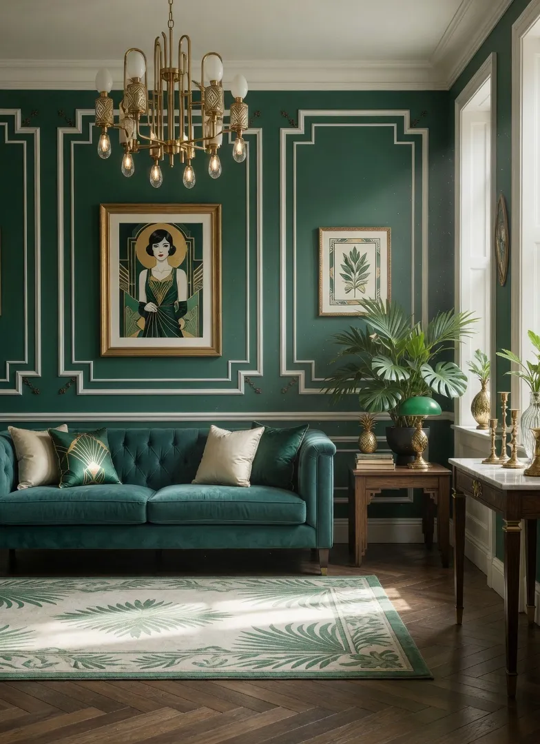
Emerald Green & Teal: The Tone-on-Tone Jewel Box
Emerald anchored the 1920s. Blending it with teal velvet pushes it firmly into this decade.
It becomes a tone-on-tone jewel box. Instead of jarring contrasts, the blue-green spectrum creates a continuous, immersive wrap around the room. I find this works wonders in rooms that already get decent natural light, allowing the heavy velvet textures to shift throughout the day. Add unlacquered brass hardware and smoked glass tables, and the room immediately loses any visual heaviness.
A custom teal velvet sofa featuring channel tufting stands as the ultimate anchor here. It masks architectural imperfections and ages incredibly well.
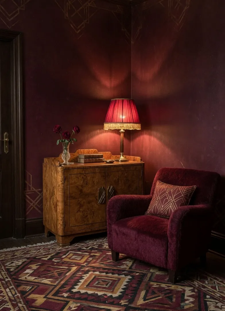
Burgundy & Oxblood: The Grounding Color Drench
Charcoal is rapidly losing ground to dark, wine-inspired hues. Burgundy and oxblood give you serious drama without the coldness of solid black.
— which is exactly why color drenching works so well here. Painting the walls, trims, baseboards, and even the ceiling in oxblood completely blurs the physical boundaries of the room. It feels heavy, romantic, and deeply grounding.
Do not break up the wall with stark white baseboards. Paint the trims and doors the exact same dark shade. When paired with polished burl wood cabinetry and subtle metallic brass accents, these intense red tones lose any aggressive edge. It forces you to slow down the moment you walk in.
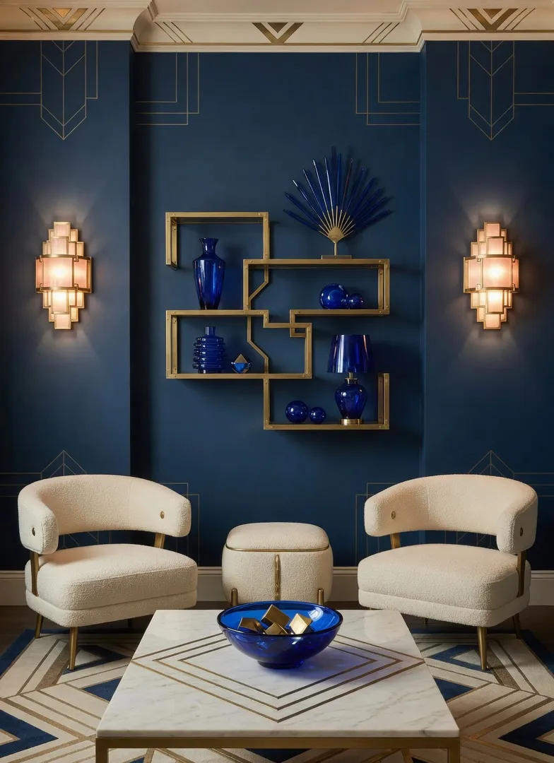
Deep Navy & Cobalt: Anchors and Sharp Pulses
If you love blue but violently oppose nautical clichés, layer deep navy with sharp cobalt.
The dark navy serves as a midnight backdrop. The cobalt injects immediate, gallery-like energy. This dynamic relies entirely on the tension between dark matte surfaces and bright gloss. A deep matte navy wall paired with a high gloss cobalt ceramic lamp sets up a visual rhythm that feels incredibly tailored and sharp.
The mistake most people make is relying solely on overhead lighting. Navy walls under a single ceiling fixture read as flat and cavernous. Layer in warm-toned wall sconces to wash the dark walls in a gentle glow.
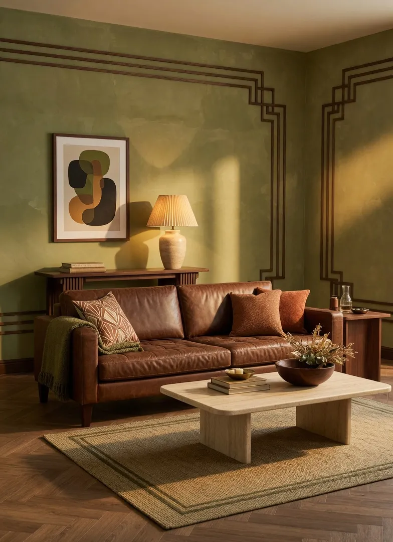
Olive & Tobacco: Warming Up Strict Geometry
Some rooms need an earthy touch. Olive green and rich tobacco brown soften the strict, stepped lines of traditional Deco geometry.
Imagine muted olive limewash walls acting as a cloudy backdrop behind a heavy, tobacco-colored leather sofa. The Neo Deco influence comes entirely through the silhouette—think curved sofa arms and structural travertine coffee tables. It reads like a collected space rather than a showroom floor.
The texture of the leather determines the entire success of this look. Opt for a matte, slightly distressed tobacco leather. Slick, shiny finishes ruin the relaxed, sun-baked vibe instantly.
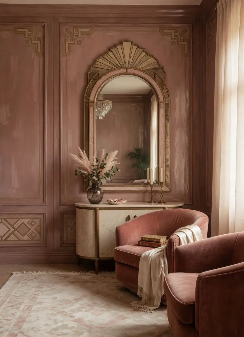
Smoky Rose & Muted Terracotta: The Sunset Palette
We are officially done with flat millennial pink. Smoky rose paired with muted terracotta delivers a dusty, sunset-inspired environment that still feels architecturally grounded by heavy Deco shapes.
The secret lies in the muddiness. A true smoky rose carries enough grey and brown undertones to act as a highly sophisticated neutral. Bring in terracotta through heavy velvet accent chairs or a geometric patterned rug, and the room feels completely enveloped in warmth. Adding a massive, arching floor mirror bounces this golden light beautifully.
Does this work with stark white ceilings? Rarely. Wash the ceiling in a soft cream, beige, or a 50% lighter shade of the smoky rose to keep the color transition seamless.
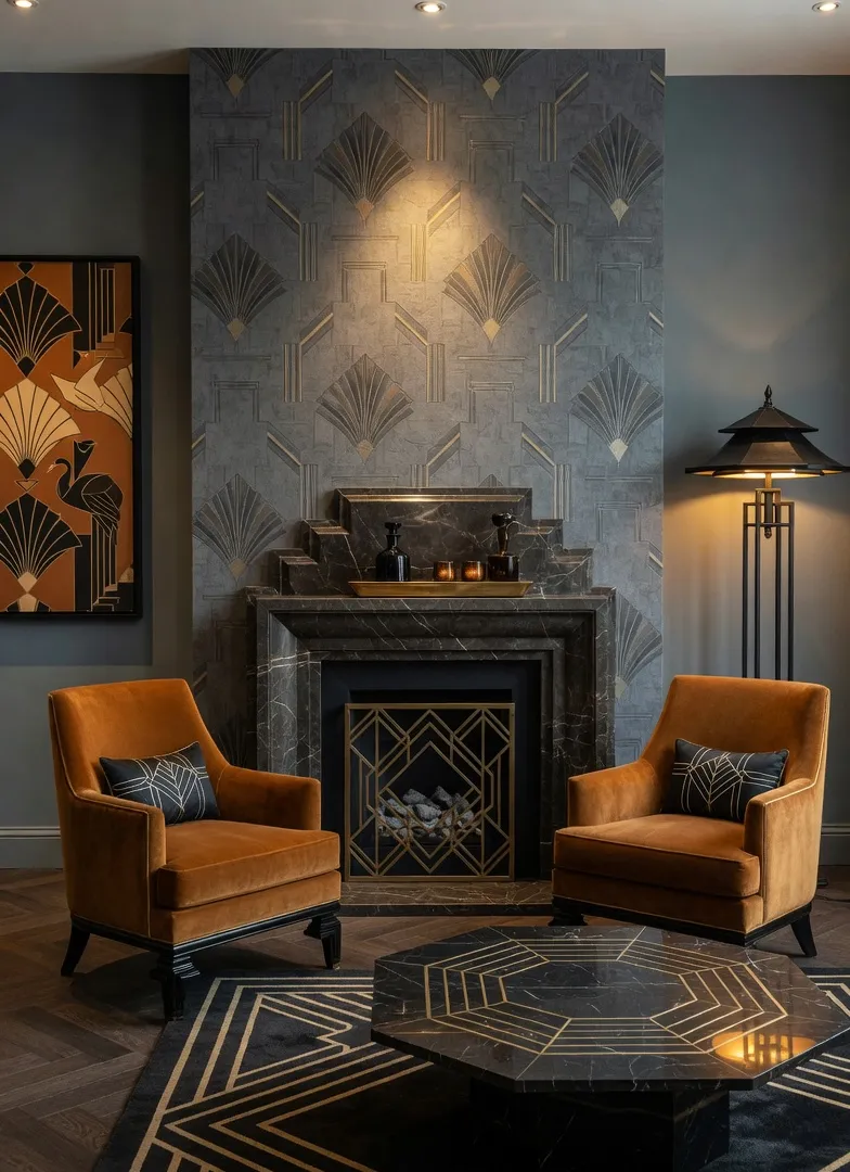
Burnt Amber & Slate Grey: High Contrast Drama
For a sharper, highly architectural edge, burnt amber and slate grey deliver massive visual impact.
The slate grey provides the deep, shadowy canvas. The golden-orange amber gets to sing without looking like a 1970s hangover. Think of a charcoal, fabric-textured wall wrapped around a pair of channel-tufted amber velvet chairs. Add a stepped black marble fireplace to anchor the Deco influence.
Using too much amber overwhelms the eye quickly. Treat slate grey as your 70% base. Amber takes 20%, and warm metallics take the final 10%. The drama lives in the contrast, not just the brightness.
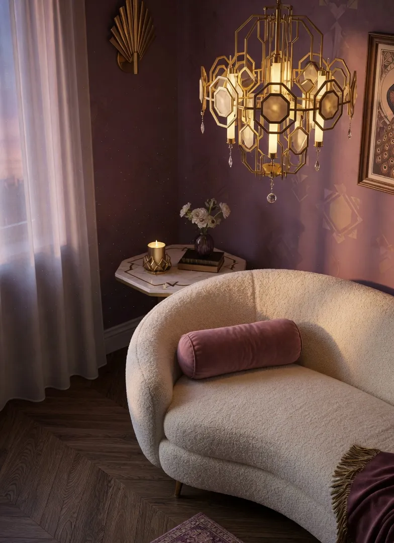
Dusty Plum & Warm Gold: The Evening Retreat
Purple has historically terrified homeowners. But a muted, dusty plum changes the conversation entirely.
Paired with unlacquered gold accents, it creates a regal yet highly accessible environment. This palette thrives after 6 PM. As the sun sets, the plum walls absorb ambient light, turning the room into a dark, velvety retreat. The gold hardware—maybe on a tiered chandelier or the legs of a heavy marble side table—pierces through the dark tones.
You do not need massive, expensive gold fixtures for this to work. Swapping out existing cabinet hardware, switch plates, or lamp bases for brushed brass delivers the same impact at a fraction of the cost.
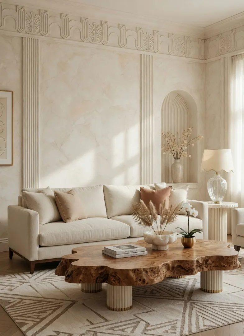
Alabaster Cream & Rich Burl Wood: The Minimalist Gateway
Die-hard minimalists transitioning into Neo Deco, start exactly here. Instead of leaning on heavy jewel tones, run soft alabaster creams against the wild, swirling patterns of rich burl wood.
The color palette stays completely quiet. Your eye focuses entirely on architectural shapes and material quality. The chaotic, organic movement in the burl wood acts as the art in the room. Fluted plaster walls and low-profile, curved linen seating keep the living room serene, tactile, and quietly expensive.
Flat white paint kills this look instantly. You must use Roman clay or a limewash finish for the alabaster walls, otherwise, the room reads as sterile instead of enveloping.
Getting the Details Right
Three things consistently make these palettes read as intentional rather than accidental:
- Flat surfaces ruin the aesthetic. You must mix your rich paint colors with ribbed glass, fluted wood paneling, heavy mohair, or looped bouclé.
- Reflective chrome leans too cold. Stick entirely to brushed brass, unlacquered brass, and antique bronze to catch the light softly.
- The tension lies in the shapes. Always pair a sharply angled, geometric rug or stepped fireplace with a soft, kidney-bean or crescent-shaped sofa.
Frequently Asked Questions
About the Author: Elena Vance
Interior design enthusiast and DIY expert. Elena Vance has spent over a decade curating spaces that blend modern aesthetics with everyday functionality. Passionate about helping you create a home that tells your unique story.


