Cherry Coded Bedroom Ideas: How to Use Red Without Ruining the Room


I painted a client's bedroom bright red in late 2024, and the next morning she called me in a panic. I'd chosen a shade that leaned slightly too orange. When the morning sun hit the walls, the room glowed the specific shade of a McDonald's interior. I had to eat $300 in paint and labor to re-prime and start over with a deeper, bluer red.
That's what orange-pull does. And it's the thing every Cherry Coded bedroom tutorial skips.
The trend itself is real and worth taking seriously. The aesthetic moves away from greige and sterile linen toward deep romantic reds paired with cream bedding, dark walnut, and warm brass. Done right, a cherry bedroom feels like sleeping inside something deliberate — moody, specific, yours. Done wrong, it looks like a warning sign.
Red is unforgiving precisely because it has the highest emotional charge of any color in a room. It demands more from the surrounding conditions — the light, the finish, the wall surface, the furniture weight — than any other shade. Get one of those wrong and the color turns on you.
Here's how to get them right.
The 5 rules of cherry execution
If you're considering the Cherry Coded bedroom look, follow these five rules before you open a can:
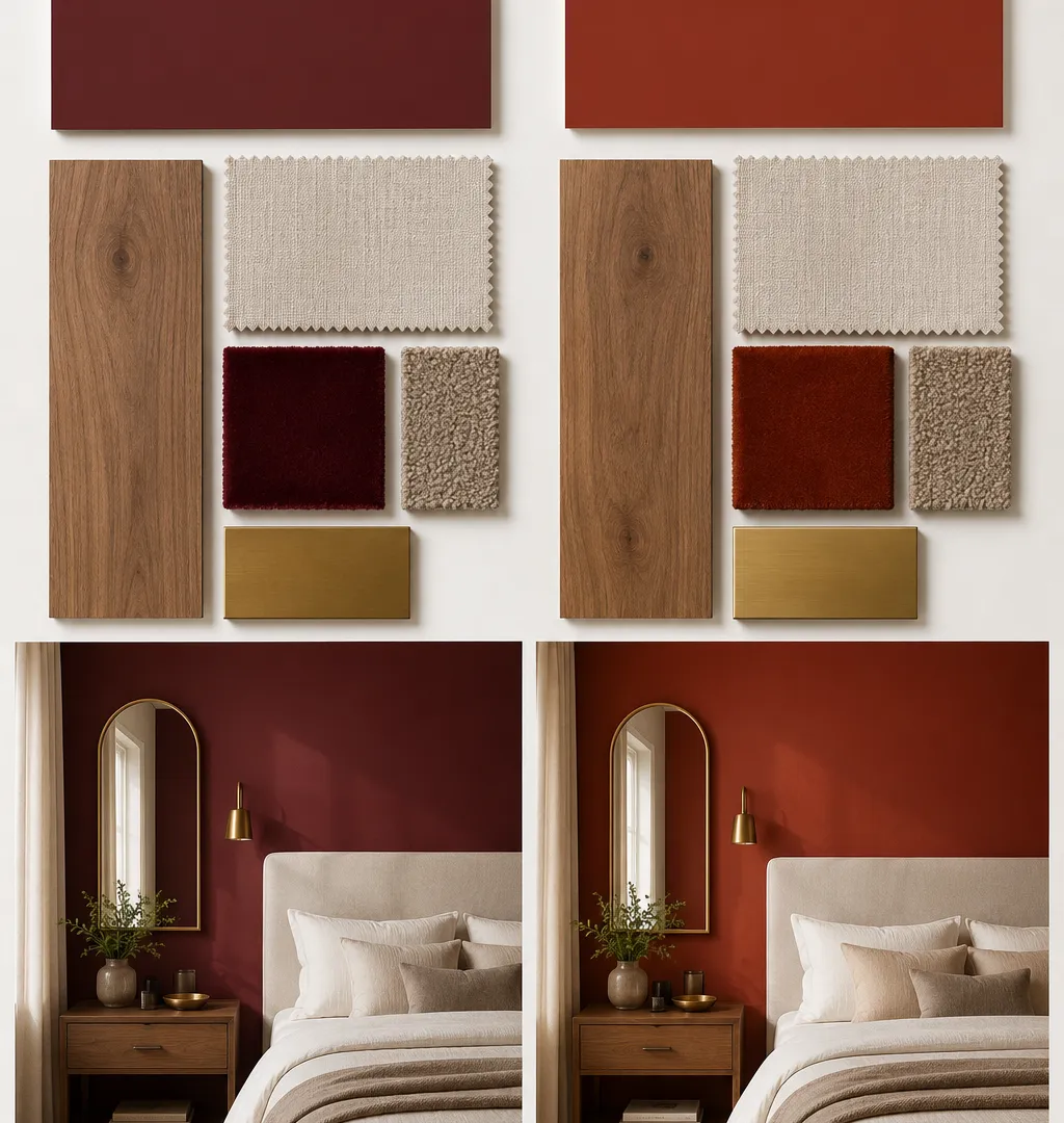
- Paint undertone first. Choose a red with blue undertones, not orange. Benjamin Moore Heritage Red (LRV 7.19) is the reference point.
- Use flat or eggshell finish. Gloss amplifies every drywall flaw. Flat deepens the color and hides imperfections.
- Get the bedding weight right. Heavy cotton-velvet duvet over crisp white linen — the texture friction is what keeps the color from dominating.
- Anchor with dark furniture. Spindly or light-colored pieces disappear against a red wall. Dark walnut or a thick upholstered headboard holds its ground.
- Use 2700K bulbs only. Blue-toned LEDs turn cherry red into muddy brown within seconds of switching on. Warm white, always.
Why paint undertone is the whole game
Most red paint failures are undertone failures. The pigment mixes that make red stable at scale almost always pull toward orange or blue — and the difference only becomes visible when daylight hits the wall.
Orange-pull reds look electric in north-facing rooms and look like a diner in south or east-facing ones. Morning light amplifies warm undertones dramatically. A shade that reads "rich cherry" in the paint store at 2pm reads "fast food" in your bedroom at 8am.
The fix is simple but counterintuitive: you want a red with a slight blue or burgundy lean, not one that photographs warm. Benjamin Moore Heritage Red (2082-10, LRV 7.19) is the one I've landed on after a few expensive lessons. It reads deeply saturated in low light and stays on the right side of burgundy in bright conditions. If that feels too committed, Benjamin Moore Dinner Party (2082-20, LRV 11) is slightly lighter with the same blue-undertone reliability.
What to avoid: anything with "rust," "brick," or "paprika" in the name is telling you something. Those warm descriptors mean orange pull.
The finish question people get wrong
High-gloss red makes every dent, nail pop, and tape edge visible. Red is a spotlight finish by nature — it doesn't forgive a wall that wasn't properly prepped.
Flat matte is the standard recommendation, and it earns it. A matte finish absorbs light rather than bouncing it, which deepens the color and softens imperfections. The downside: it marks and scuffs more easily, which matters in a bedroom where you're moving around furniture and touching walls regularly.
My approach: eggshell on the walls, matte on the ceiling. Eggshell gives you durability while keeping the color saturated. Matte on the ceiling absorbs ambient light that might bounce the color back strangely. That combination also makes the room feel like the color is contained rather than radiating — a meaningful difference when the shade is this intense.
10 ways the Cherry Coded bedroom looks in real rooms
Understanding the rules is one thing. Here's how the aesthetic gets applied — with a realistic read on each approach, including the ones I'd skip.
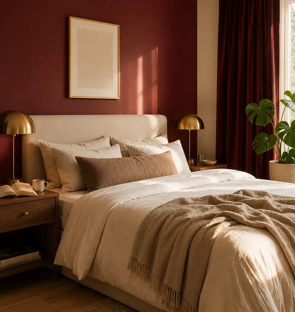
1. The focal wall with velvet curtains
One Heritage Red wall behind the bed, floor-to-ceiling velvet curtains in the same color family. This is the cleanest application of the trend and the hardest to mess up, because the curtains provide enough visual mass to stop the wall from looking like a single painted surface. Keep opposite walls white or warm cream — not gray, which fights the red's warmth instead of supporting it. The brass hardware on the curtain rod matters more than people expect; chrome reads cold against cherry and pulls the whole thing toward garish.
2. The painted canopy
Instead of a full accent wall, paint a rectangle exactly the width of the bed frame and extend it straight up onto the ceiling — a framed backdrop that acts like built-in architecture. I did this for a client last year for about $40 in paint and two hours of careful taping. The effect reads as a $2,000 structural detail. The one requirement: clean, straight tape lines. If the edges are uneven, the whole thing reads as amateur. Use Frog Tape, not standard painter's tape, and pull it while the paint is still slightly wet.

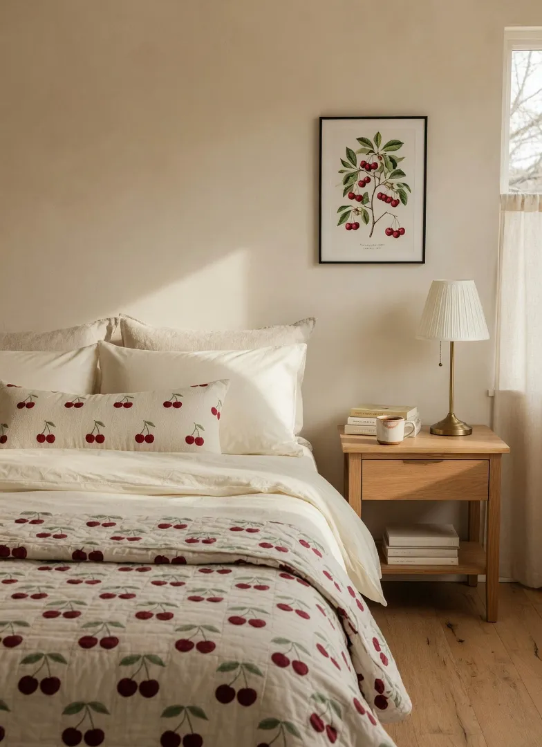
3. Cherry motifs on a neutral ground
For anyone not ready to commit to paint: keep the walls warm cream and let the bedding carry the aesthetic. A block-printed quilt with dark red cherries, a cherry-embroidered lumbar pillow, one botanical cherry print framed above the nightstand. The limit here is restraint — two cherry motif pieces read as a deliberate aesthetic choice, five read as a themed hotel room. If you find yourself buying a cherry-shaped hook for the back of the door, you've crossed a line.
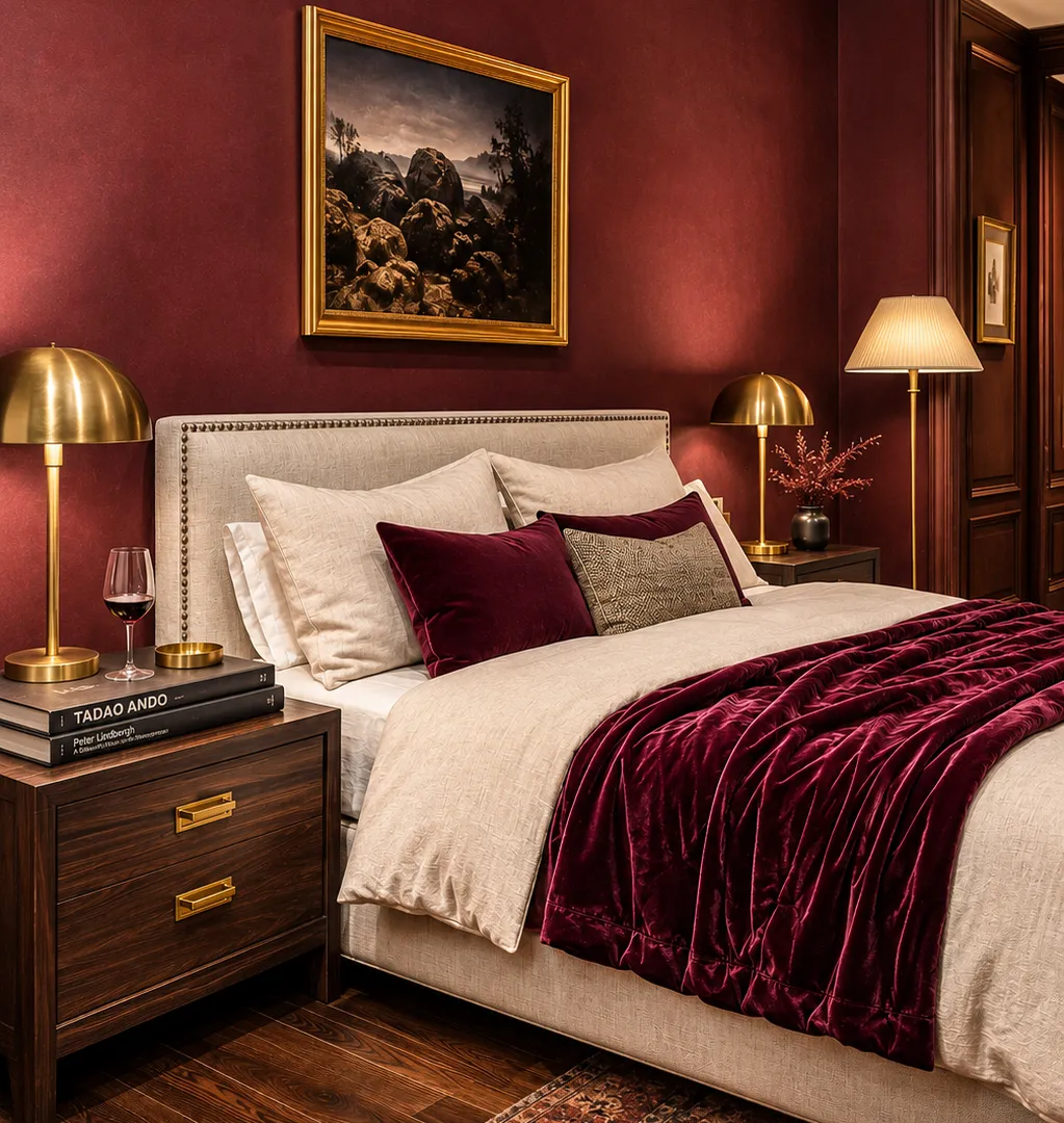
4. Dark cherry pushed toward burgundy
Take the color almost to black cherry — a deep wine-red that reads architectural rather than romantic. Paired with dark walnut floors and aged brass hardware, the room stops being charming and starts being serious. This is the version of the trend that doesn't date. The risk is north-facing rooms with low natural light; in those conditions it can feel oppressive by evening. The fix is warm lamplight at two or three heights, never overhead, which gives the room dimension instead of just darkness.
5. The retro diner iteration
Cherry red metal bed frame, black-and-white checkerboard rug, chrome hardware on the nightstands. Highly stylized. Requires a specific personality to live with daily — one that signals genuine humor about design. I'm not against it, but I'd want to sleep in this room for a week before committing. The people who pull it off love it unconditionally. The people who don't end up painting everything beige within two years and don't understand why it didn't work. The answer is usually that they liked the idea more than the reality.

6. The TikTok coquette version
Deep red mixed with lace trim, ribbon detail on throw pillows, and blush pink accents. Genuinely fun. Shelf life of roughly 18 months. If you're painting walls for this look, you'll be repainting by 2028 — the trend is already peaking. If you want this aesthetic, keep it entirely in textiles: a lace duvet cover, a velvet throw in deep raspberry. That way you can swap out when the mood shifts without touching the walls.

7. Mid-century modern cherry
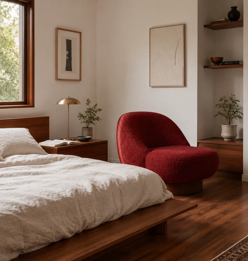
White walls. Teak platform bed. One large cherry-red statement piece — either a significant artwork or a single lounge chair in red wool boucle. This is how people who hate visual commitment still get the trend. The discipline is stopping at one red anchor piece. Two red statement pieces in a minimalist room cancel each other out; the eye can't decide where to go and lands nowhere.
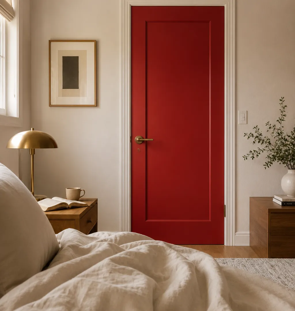
8. The inside-the-door trick
Don't paint the walls. Paint the inside face of your bedroom door cherry red — the side you see when lying in bed looking at a closed door. It's a shock of color visible only from inside the room, completely invisible when the door is open. Costs one pint of paint and two hours. It's also reversible in an afternoon, which makes it the right starting point for anyone genuinely unsure whether they can live with this color. If you love it on the door, you'll love it on the wall. If it bothers you after two weeks, you've learned something cheap.
9. Layered textures, single color
A room that relies entirely on material variation rather than pattern or contrast. Red wool rug, red velvet armchair, red linen throw, cream walls. The visual interest comes from how the different materials catch light differently — velvet absorbs, linen reflects, wool sits somewhere between. This approach requires quality materials; cheap fabric in this color reads flat and slightly artificial. Budget more per piece, buy fewer pieces, and the room still looks right in five years. Budget less and buy more, and it looks right in the store and wrong in the room.

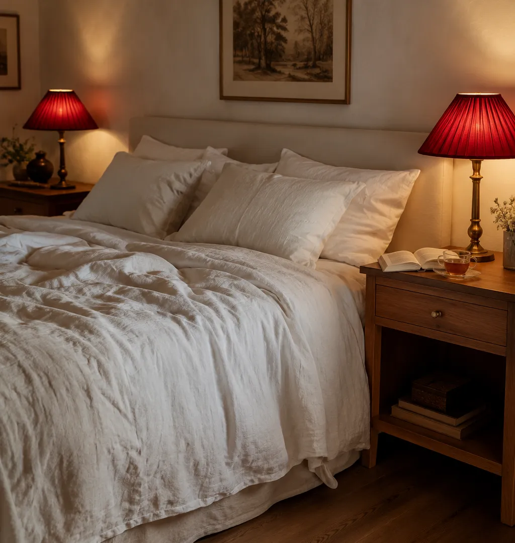
10. The $40 lampshade swap
Change the lampshades on your bedside tables to pleated cherry-red silk. The silk casts a warm pinkish-red glow across the nightstand area — flattering light, immediate atmosphere, reversible in 20 minutes. It won't give you a Cherry Coded bedroom in the full sense, but it gives you the feeling of the trend. If you like the glow, you'll know you can handle the color on a larger surface. If it feels like too much, you've lost $40 and one Saturday afternoon, not a weekend of painting.
The Cherry Coded trend works because it's a response to a decade of nothing — rooms that played so safe they stopped feeling like anywhere. Red commits. The rooms that pull this off aren't the ones with the most red — they're the ones where someone understood what the color needed and gave it exactly that: the right undertone, the right finish, the right light, and furniture heavy enough to hold its ground.
Frequently Asked Questions
About the Author: Elena Vance
Interior design enthusiast and DIY expert. Elena Vance has spent over a decade curating spaces that blend modern aesthetics with everyday functionality. Passionate about helping you create a home that tells your unique story.

